Studio
Introduction
The Studio tools allow you to customise the information shown in the modules and how it is displayed.
To access Studio, log in as an Administrator user. In the top-right corner of the screen you find a menu with a profile figure icon. Click this icon, then select "Admin". Scroll down the page and click "Studio".
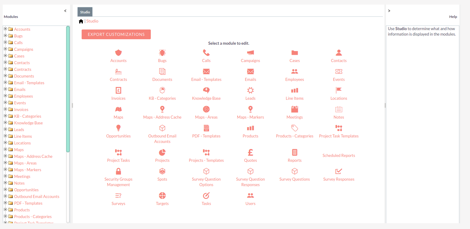
When Studio is opened, it will display a list of all the modules which can be customised. Click to select the required module.
For each module, there are several components which can be edited.
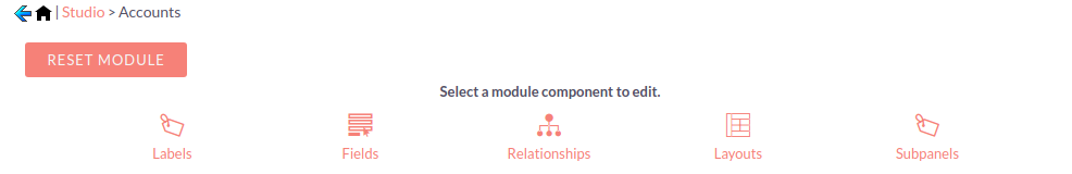
Labels: View/edit field labels and the module name
Fields: View/edit field properties and add new fields
Relationships: View/edit/add relationships between modules
Layouts: Customise the edit/detail/list and filter views
Subpanels: Set which columns are displayed on module subpanels
Labels
Selecting the Labels component lists all the field labels for the module. Edits to labels will be reflected on the module layouts.
Click and type to make the required changes to the labels and then click SAVE & DEPLOY.
A confirmation message will appear once the changes have been saved. You should now be able to see the changes to the labels when you navigate to the module.
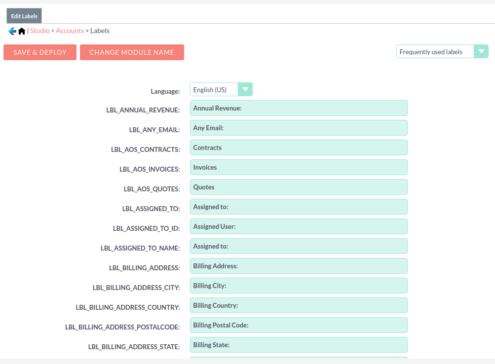
Clicking CHANGE MODULE NAME will allow you to change the label for the module itself. See the Rename Modules section of the Developer Tools documentation for more details.
Fields
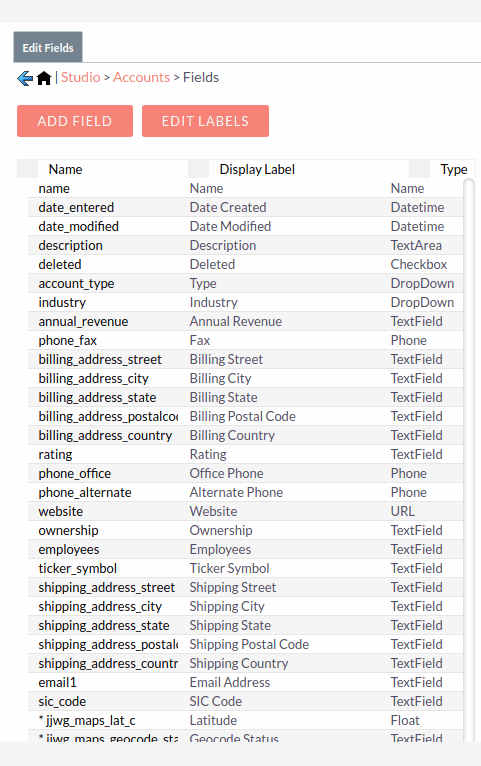
Selecting the Fields component displays all the available fields for the module, with their display label and data type.
Adding A Field
You can add a custom field to the selected module by clicking ADD FIELD.
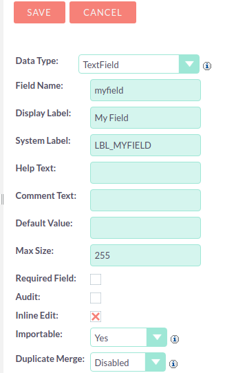
Enter the details for the new field. Depending on the data type selected for the field, some or all of the following properties can be set for the field:
Data Type: |
The type you select determines what kind of characters can be entered for the field. For example, only numbers that are integers may be entered into fields that are of the Integer data type. |
Field Name: |
The field name must be alphanumeric and must not contain any spaces. Underscores are valid. |
Display Label |
The label which will be displayed alongside the field in the views. |
System Label: |
This label is used to refer to the field in the code. |
Help Text: |
Optional explanatory text to display temporarily when the user hovers over the field. |
Comment Text: |
This is only visible in Studio and Module Builder, as a description for administrator use. |
Default Value: |
The field will have the value set here unless the user enters a new value. |
Max Size: |
The maximum number of characters that can be entered into the field. |
Mass Update: |
Enable to mass Update feature for this field. |
Required Field: |
Whether or not a value must be entered for the field before a record containing the field can be saved. |
Audit: |
If this is selected, changes made to the field value can be tracked from the record’s Change Log. |
Inline Edit: |
Whether or not the field can be edited inline, when this option is enabled in the System Settings. |
Importable: |
Select an option to allow, disallow or require the field to be imported when using the Import Wizard. |
DuplicateMerge: |
Select an option to enable or disable the Merge Duplicates and Find Duplicates features. |
Field Types
Studio comes out-of-the-box with many different types of fields which can be created in SuiteCRM.
The following data types are available when creating fields in Studio:
Data Types |
Description |
Address |
Creates fields for street, city, postal code, state, and country. |
Checkbox |
Creates a checkbox for data fields with a Yes/No action |
Currency |
Creates a field to enter a currency value. The system automatically creates a dropdown of the currency type if the field does not already exist in that module |
Date |
Creates a field to enter a date. Includes a button for a calendar popup |
DateTime |
Creates a field to enter the date and time. Includes a Calendar icon button to choose a date via the popup calendar, as well as a dropdown list to select the time |
Decimal |
Creates a field to hold a number rounded to a specified decimal precision. SuiteCRM stores the exact representation of the number in the database (e.g. For a precision of 2: 2.539 is stored as 2.60) |
DropDown |
Creates a field where you can associate a dropdown list of values |
DynamicDropdown |
Creates a dropdown list from which you can relate a single record from a variety of modules. |
Flex Relate |
To specify a one-to-many relationship with another module, but allows linking to several kinds of modules. For example, Notes use a Flex Relate so they can be related to Accounts, Contacts, Leads, etc. Only one Flex Relate-type field is allowed per module, which explains why you can’t add another field of this kind to the Accounts, Calls, Meetings, Notes, and Tasks modules. |
Float |
Creates a field to hold a number rounded to a specified decimal precision. SuiteCRM stores the value differently based on the database platform SuiteCRM is running on |
HTML |
Creates static HTML-formatted text to display in record views |
IFrame |
Creates a field to store a URL to display in an iFrame in record views. This URL can also be generated dynamically from data in other fields. |
Image |
Creates an image field to upload an image to display on a record |
Integer |
Creates a field to specify positive or negative numbers with no decimal places |
Multiselect |
Creates a dropdown list of values where multiple values can be selected at once |
Phone |
Creates a field to enter a phone number |
Radio |
Creates a radio button for a user to select one value from a dropdown list |
Relate |
Creates a field to associate a record with another module’s record as a one-way relationship. You can add multiple Relate fields to a module. |
TextArea |
Creates an open text area field for multiple lines of text |
URL |
Creates a field to store a URL and display as a clickable link. This URL can also be generated dynamically from data in other fields. |
TextField |
Creates a field for a single line of text |
Adding A Dropdown Field
When adding a field of type DropDown, you need to additionally specify the
dropdown list. This contains the list items which will be displayed for the dropdown.
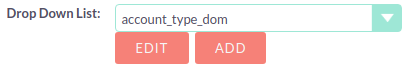
You can select an existing dropdown list if appropriate, or click ADD to create a new one.
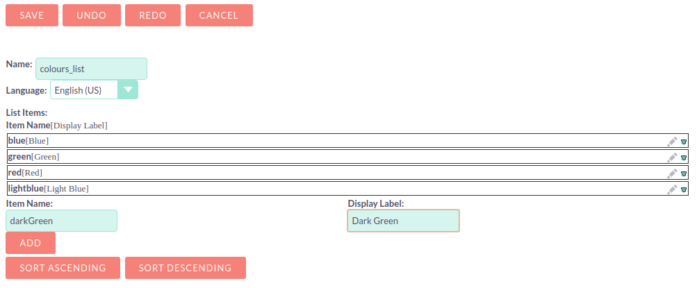
For each item to include in the list, enter:
Item Name |
Used to refer to the dropdown item in the code, this must be alphanumeric, begin with a letter and contain no spaces. |
Display Name |
The text shown to the user. This may contain spaces and special characters |
Click ADD to add each new entry.
To add a blank item, click ADD without entering any values for the Item Name and the Display Label. It is not possible to add a blank name, but with a non-blank label.
The list can be optionally sorted alphabetically by the Display Label by clicking the appropriate SORT button. If you want to set a default item, this is not the place to configure that; instead, look for a "default value" option in the settings for the field that will be using this dropdown.
Click SAVE to save the new dropdown list and return to the field properties.
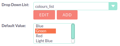
The dropdown list items you have created will now be visible. If desired, you can select a default value for the dropdown.
Editing A Field
Click on a field to view the field’s properties. These can be edited in the same way as detailed above for adding a new field.
Deleting A Field
Only fields that have been created in Studio can be deleted via Studio. Core fields cannot be deleted.
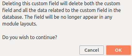
Select the field you wish to delete and click DELETE A warning message will appear asking you to confirm the deletion as both the field and any data related to the custom field will be deleted from the database and the field will no longer appear on any module views.
Relationships
A relationship represents a two-way link between two modules. Selecting the Relationships component displays all the relationships between the currently selected module and other deployed modules.
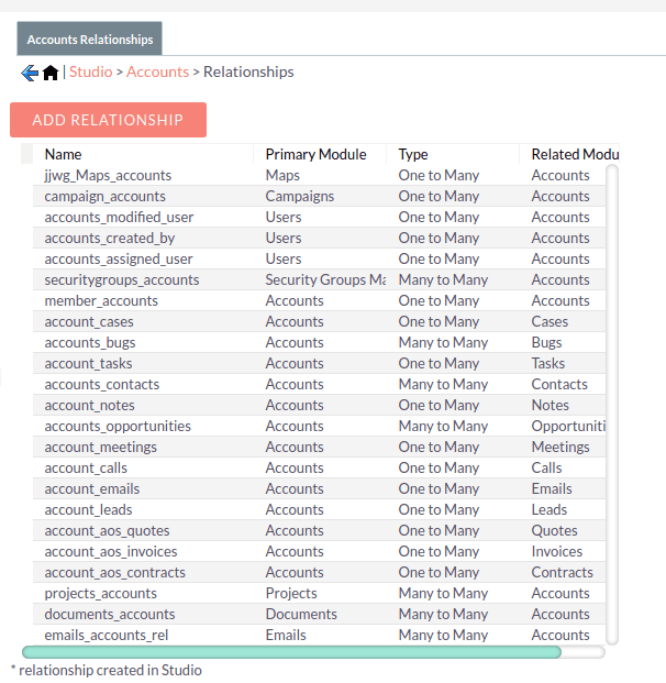
Click on a relationship to view the relationship properties.
Click ADD RELATIONSHIP to add a new relationship for the selected module.
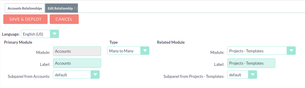
The Primary Module will be set to the currently selected module.
Specify the relationship type:
One to One
With a One-to-One relationship, each record in the primary module may only have one related record in the related module, and vice versa. This type of relationship will add a relate field to both modules' records.
One to Many
With a One-To-Many relationship, records in the primary module may be related to one or more records in the related module, but each related module record is only related to one primary module record. This will add a relate field to the related module’s records, but the primary module will display a subpanel where more than one related module records can be added.
Many to Many
With a Many-To-Many relationship, records in the primary module can be related to one or more records in the related module, and vice versa. Each module’s records will contain a subpanel for the related records.
Select the Related Module from the dropdown list.
Where there are subpanels, subpanel views for the module(s) can be selected.
Click SAVE AND DEPLOY to save the relationship.
Layouts
Layouts can be edited in Studio to customise the module views shown to users.
Edit View
Edit view is displayed when editing a record or creating a new one.
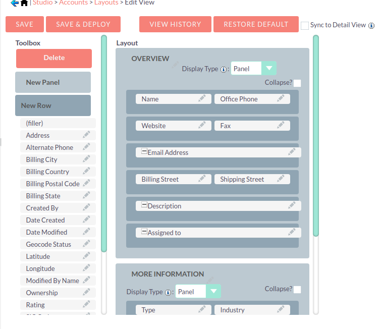
The current layout is displayed in the main panel on the right-hand side. Unused fields are shown in the list on the left hand side.
Select Sync to Detail View if you wish any changes made to fields or field placement to be automatically applied to the corresponding Detail View. Note that layout changes cannot be made to the Detail View when this option is set.
Adding Fields
Fields can be added to the view either as a new row in an existing panel (section), or by adding a new panel.
Click and drag the New Row or New Panel element to the desired location in the layout on the right-hand side.
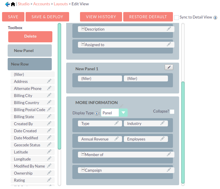
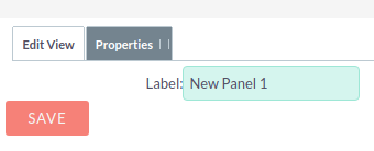
If you have added a new panel, this can be renamed by clicking the pencil icon. This will open the edit view for the panel label. Edit the label and click SAVE to return to the layout.
A new row will automatically be created with two columns.
Drag and drop the required fields to the new row. Clicking the + button will span the field across both columns.
Click SAVE AND DEPLOY to save the layout changes. These should now be visible when you navigate to the Edit view for the module.
Deleting Fields
Delete fields, row or panels from the layout by dragging them to the Delete area on the left-hand side.
Click SAVE AND DEPLOY to save the layout changes.
Detail View
Detail View is a read-only view, shown when a record is opened.
The Detail View layout can be edited in exactly the same way as for the Edit View. Note that if you have Sync to Detail View selected on the Edit View, you will not be able to make changes to the Detail View.
List View
The List View is shown when a module is opened, and lists all the records in the module.
Customise which fields are shown in the list view, and the order in which they are displayed here.
Default |
Fields in this column will be shown by default in the list view. Re-order by dragging and dropping the field names. |
Available |
Fields in this column are available for users to add to the list view using the Column Chooser button on the list view. |
Hidden |
These fields are hidden from users and cannot be added to the view. |
Drag and drop the module fields between the columns to customise the list view.
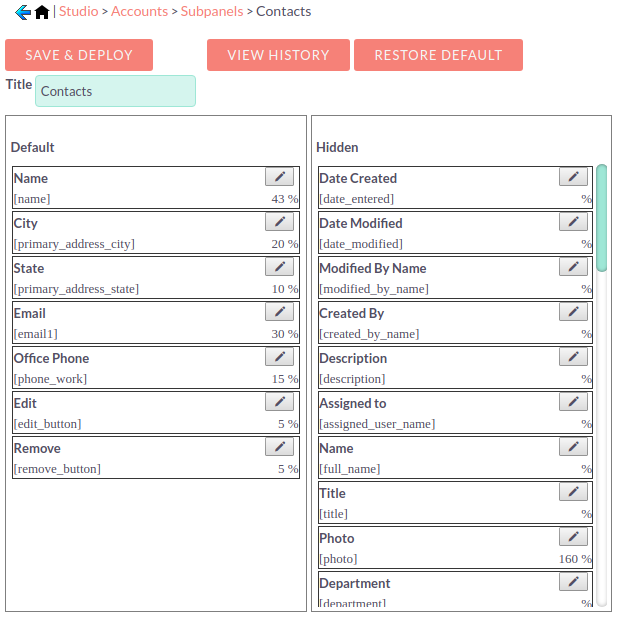
Subpanels
Use this section to customise which fields are shown on a particular subpanel.
Select the subpanel. Fields shown in the Default column will be shown on the subpanel. Drag and drop the required fields between the two columns.
Click SAVE & DEPLOY
Export Customisations
You can export module customisations that you have made in Studio, and upload these into another SuiteCRM instance via Module Loader
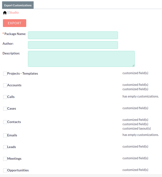
Enter a name for the package, and optional author and description details.
Select the module(s) that contain the customisations you wish to export. Only modules containing customisations will appear for you to select.
Click EXPORT. This will create and download a .zip file containing the module customisations. Use Module Loader to upload and install the customisations on another SuiteCRM instance.